
Envision Math 5th Grade Textbook Answer Key Topic 19.2 Histograms
Histograms
How do you make and interpret a histogram?
Answer:
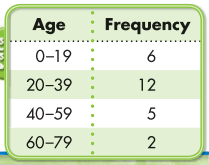
A radio station recorded the ages of 25 callers in a phone survey.
This data can be shown by a histogram, a bar graph that groups data into equal intervals shown on the horizontal axis. There is no space between the bars.
Question.
Make a histogram to show the frequency of data in each age interval.
Answer:
Guided Practice
Do you know HOW?
Question 1.
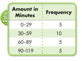
The table shows the number of minutes 25 students spent on homework each night. How would the lengths of the bars compare if you made a histogram to show the data?
Answer:
Do you UNDERSTAND?
Question 2.
According to the histogram in Exercise 1, what fraction of the students surveyed spent 30-59 minutes on homework each night?
Answer:
Question 3.
In the example above, how can you tell that \(\frac{1}{5}\) of the people surveyed were in the 40-59 age group?
Answer:
Independent Practice
Question 4.
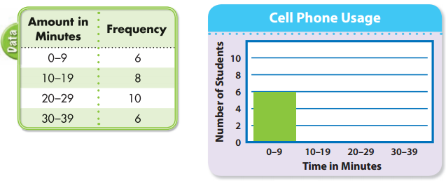
The table shows the results of a class survey about the amount of time students spend on their cell phones each day. Copy and complete the histogram shown at the right.
Answer:
Step 1: List the age intervals along the horizontal axis.
Step 2: Along the vertical axis mark the scale. List the greatest and least numbers in the survey results Choose an interval. Label the axes.
Step 3: Graph the data by drawing bars of the correct height. Title the graph.
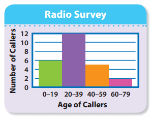
Step 4: Interpret the graph. Twice as many people were in the 20-39 age group as in the 0-19 age group. Most people were in the 20-39 age group.
The group with the least number was the 60-79 age group.
Problem Solving
One class took a survey of the amount of money they spent on CDs over 3 months and made a histogram of the results. The histogram is shown at the right.
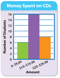
Question 5.
a. How many students were surveyed?
Answer:
b. What fraction of students spent between 0 and $9.99 on CDs?
Answer:
c. In which range of money spent did twice as many students buy CDs than in the $20-$29.99 range?
Answer:
Question 6.
Reasoning Selma says that a histogram shows that 4 times as many people in the 21-25 age group answered the survey than in the 36-40 age group. How does she know this from looking at the histogram?
Answer:
Question 7.
On a coordinate grid, Sue drew a path starting at (6, 2). She moved 2 spaces to the right and 3 units up. What is the ordered pair for the point where she stopped?
Answer:
Question 8.
On a class trip, Harry spent $28. Nate spent $6 less than Harry. Which expression could you use to find how much both boys spent?
A. 28 + 28 + 6
B. 28 + (28 – 6)
C. 28 – (28 + 6)
D. 28 – 28 – 6
Answer:
Question 9.
At 6 A.M., the temperature was -5°F. By noon, the temperature had increased by 12°F. What was the temperature at noon?
A. 17°F
B. 7°F
C. -7°F
D. -12°F
Answer: